Upgrading your home’s exterior has many benefits, not the least of which is a nice welcome home every day. Whether you freshen up your finishes, add a new garage door or redo your landscape, there are many ways to elevate your home’s curb appeal. These six before-and-after projects offer a sample of what can be done. See the exteriors, then take a look at the rest of each home.

Exterior 1: Before Photo, original photo on Houzz
1. Decatur, Georgia
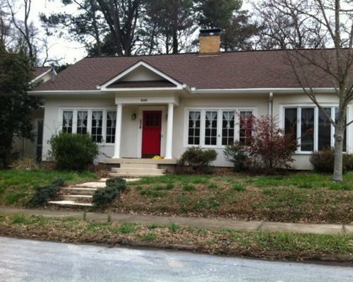
BEFORE: When the homeowners bought the property in Decatur, Georgia, the brick exterior was buried beneath a layer of stucco. The columns, pediment and bay window felt as though they’d been imposed on the structure, which didn’t have the scale to carry off such details, designer and builder Ili Hidalgo-Nilsson says.
Exterior 2: Terracotta Design Build, original photo on Houzz
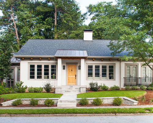
AFTER: The design-build team simplified the exterior detailing and replaced the bay window with French doors and French balconies. They updated the electrical and plumbing, replaced the windows, and added insulation throughout.
Exterior 3: Before Photo, original photo on Houzz
2. Baton Rouge, Louisiana
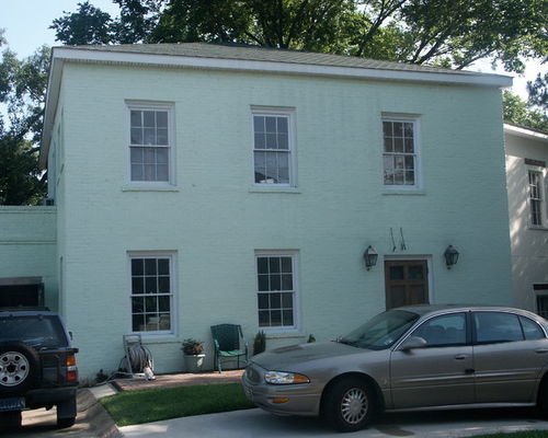
BEFORE: For this 1939 Colonial Revival house in Baton Rouge, Louisiana, the front yard’s previous circular driveway was removed and replaced with a grass lawn to create a more natural curb appeal.
Exterior 4: TY Larkins Interiors, original photo on Houzz
AFTER: The custom shade of white paint selected for the home’s exterior was inspired by the shade of white often found on buildings in Paris. “It has this antique, earthy quality to it that’s timeless,” designer Ty Larkins says. The home’s front windows also received functioning shutters that helped bring it back to its Colonial Revival roots.
Exterior 5: Before Photo, original photo on Houzz
3. Chevy Chase, Maryland
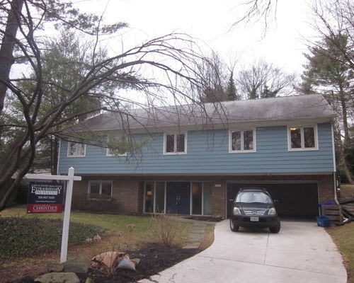
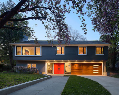
BEFORE: Homeowners Di Bruning and David Owen felt that the exterior of the 1968 house in Chevy Chase, Maryland, had a somewhat oppressive look. However, the lot, which slopes up from the street, afforded a spacious two-level floor plan, with the garage, family room and a bedroom built into the hillside on the first level, and the kitchen, dining room, living room and four bedrooms upstairs.
Exterior 6: Balodemas Architects, original photo on Houzz
AFTER: Architect Lou Balodemas updated the home’s curb appeal by installing a new entry door and sidelights; new windows, including an enlarged opening for the second-floor living room; new fiber cement siding for the upper level; and a new garage door. “The original entry door was a bit recessed,” Balodemas says, “so we popped it out to give the foyer a few more feet of space.” He also added a new front walkway to create a grander approach to the house.
Related: Stylish New House Numbers to Bump Up Your Curb Appeal
Exterior 7: Before Photo, original photo on Houzz
4. Berkeley, California
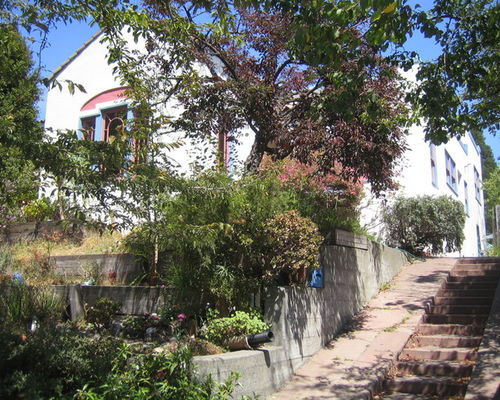
BEFORE: Here’s a look at the overgrown landscaping at the front of Geoff Lomax and Sabina Aurilio’s home in Berkeley, California. The wooden retaining walls were starting to fail, and the foundation was showing signs of sinking.
Exterior 8: Mediterranean Exterior, original photo on Houzz
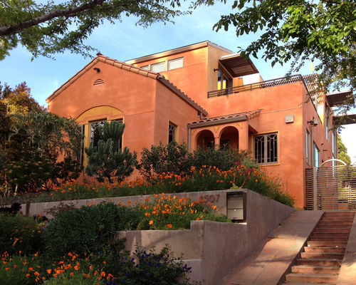
AFTER: The yard was dug out and the landscaping replaced with new drought-tolerant plantings. The foundation was ripped out and replaced. The stucco was redone and repainted, and new lightweight shingles that fit with the Mediterranean style of the home were added.
Exterior 9: Before Photo, original photo on Houzz
5. Palm Springs, California
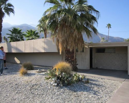
BEFORE: Though the exterior of the 1958 home in Palm Springs, California, was in OK shape, parts of the ceiling were caving in, most of the windows were broken, and the home hadn’t been cleaned in years.
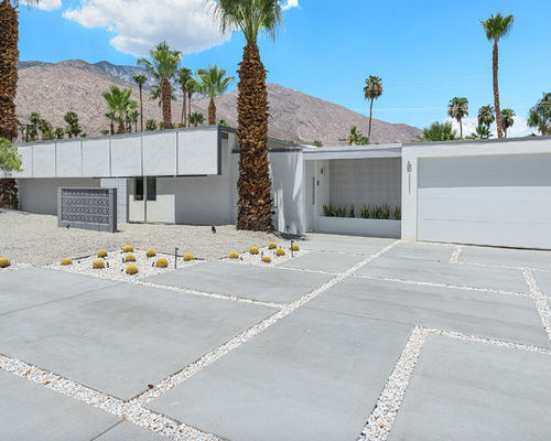
Exterior 10: H3K Design, original photo on Houzz
AFTER: Kevin Kemper and Howard Hawkes of H3K Design preserved the facade, including the “sun flap,” a common element used in the 1960s to keep sunshine from hitting inside the house and heating it up too much.
They took the rest down to the studs, then added new stucco, plumbing, electrical work, insulation and a new roof. “It was a big preservation effort on our part,” Kemper says. “There was some unusual architecture, and we were afraid someone would tear it down or alter it and you wouldn’t be able to recognize the home.”
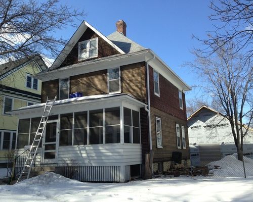
Exterior 11: Before Photo, original photo on Houzz
6. St. Paul, Minnesota
BEFORE: The home had a 22-by-7-foot enclosed porch across the front that created an uninviting entrance. Fake brick asphalt shingles covered one portion of the home. “Close up, the fake brick asphalt was pretty nasty,” architect David Strand says. “The house was very true to what it was, but it was dirty and it went beyond what the owner was able to do with it.”
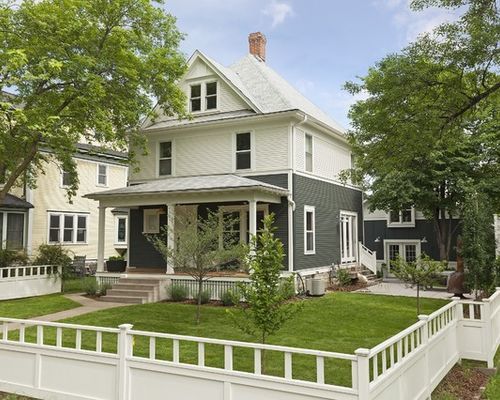
Exterior 12: Strand Design, original photo on Houzz
AFTER: Strand removed the enclosed front porch and added an open porch with three columns that hold up the extended white roof. “It’s nice to be able to sit on an open porch and have that neighborhood feel,” Strand says. “This returns the house to the original concept, which was important.”
He also eliminated the fake brick asphalt shingles. A trim band breaks up the house, creating a two-tone look with warm white on top and a gray with green tones on bottom. “I love dark houses,” Strand says. “It was nice to have a white urban farmhouse but also have a bit of a modern feel.”
By Bryan Anthony, Houzz
 Facebook
 X
X
 Pinterest
 Copy Link
