Hello! I’m Matthew Gardner, Chief Economist for Windermere Real Estate and welcome to this latest edition of Mondays with Matthew.
Before I get going with this months’ discussion, I did want to thank you for all the very gracious comments I received following last month’s video when I offered my views regarding the rumor that’s circulating about a new housing bubble forming.
Well, today we’re going to stay inside the same broad topic, but this time we will be focusing on why home prices have been able to rise at such a significant pace over recent years but—more importantly—I’m going to share my analysis showing that, in reality, home prices are actually not as high as they appear on face value!
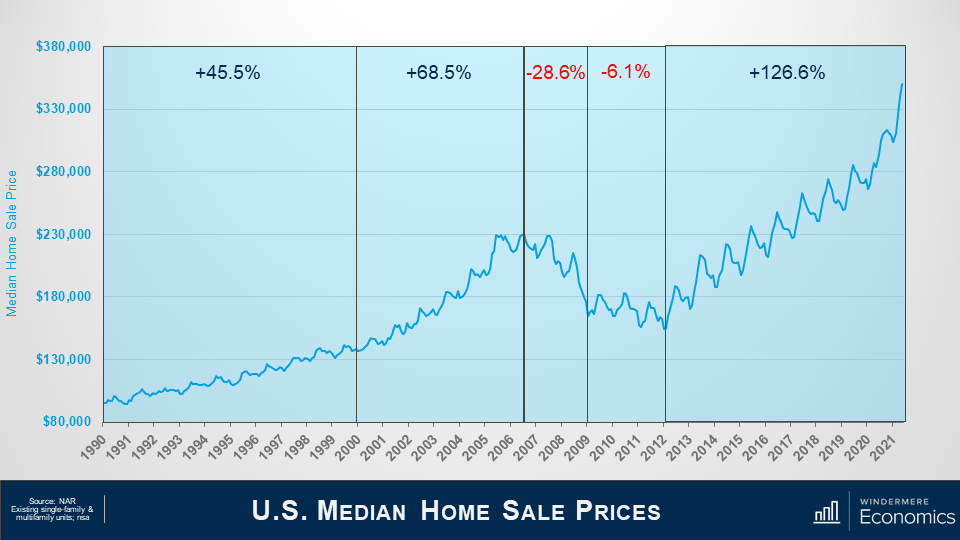
For context, let’s look at home prices over the past three decades and this chart shows the median sale price of existing homes—both single-family and multifamily—over time.
In the 1990’s – prices rose by over 45%.
And this was followed by a significantly faster pace of appreciation as the housing bubble was really getting inflated—with prices soaring by over 68% between the start of the decade and its ultimate peak in the summer of 2006.
Well, we all remember what happened then! The bubble burst, with prices dropping by almost 29% between July 2006 and early 2009.
This was followed by a brief period of relative stability—due to the introduction of the first-time homebuyer buyer tax credit—but, as the impacts of that stimulus wore off, prices dropped further, bottoming out in January of 2012—32.9% below the pre-bubble peak.
But, from 2012 until today, sale prices have shot up by more than 126%—a remarkable number—and I would add that prices are up by over 42% since the end of 2017; 37.5% since 2018; and 27.6% since the start of this decade.
Interestingly, well, interesting to me at least, the number of homes sold actually bottomed out in 2010—well before prices hit their low point. And this was because a lot of buyers got into the market for one primary reason: home prices were cheap! So cheap, in fact, that back then you could actually buy a home in many markets for less than it would cost to build the very same home.
Now, given the pace of price growth that we have seen since the 2012 trough, I’m really not at all surprised to hear rumblings regarding bubbles. But is this really the case?
Let’s take a peek at what had been going on with mortgage rates over the same time period.
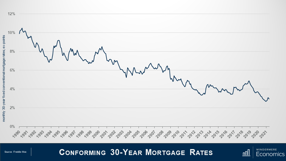
As home prices were rising, what were mortgage rates doing? That’s right! They were falling. Of course, there were some periods where rates trended higher—most recently in 2018—but I really want you to look at the overall direction of rates over the last 30 years. They’ve been heading in one direction and that’s down.
So! What happens when we overlay sale prices with mortgage rates?
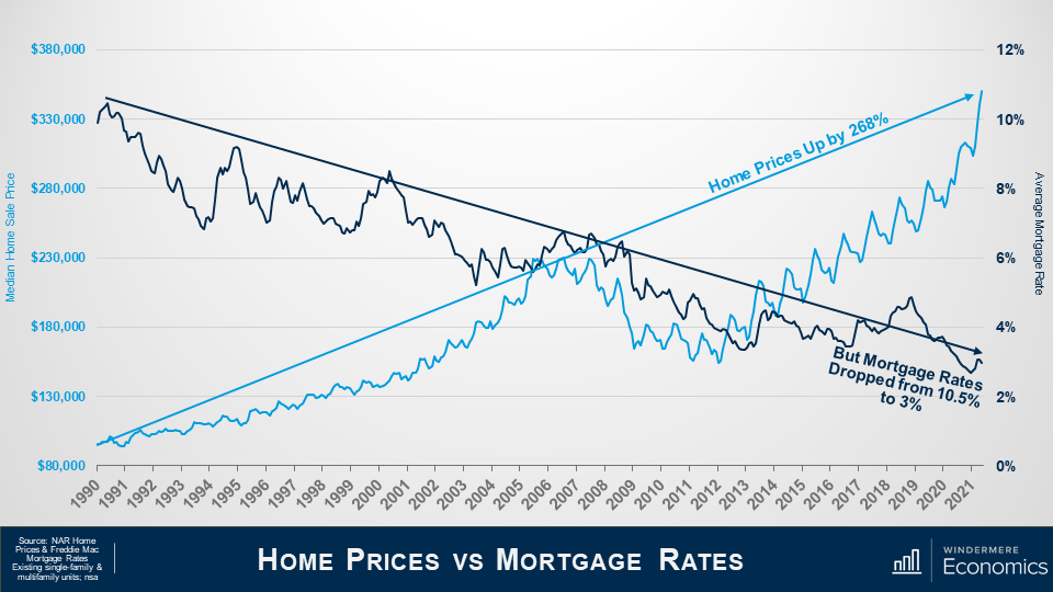
Here are the sale prices we looked at earlier.
And here are mortgage rates.
Prices are up by almost 270% over the past three decades.
But in the same time period, mortgage rates have fallen from over 10% to around 3%. And it is this massive drop in rates that, over the long-term, allowed buyers to finance more expensive homes and this, naturally, has led prices higher.
And this is a part—just a part mind you—of the reason why prices have been able to rise so significantly.
So! Prices have risen almost threefold as the cost to finance a home has dropped by 72%.
But that’s not the whole story.
You see, it’s not accurate to simply look at the change in home prices over time without considering inflation, and the impacts here are very significant.
Inflation plays a substantial part in understanding prices of any commodity, and that certainly includes housing.
But before we dig into this part of the discussion, I have to give a shout out to Bob Shiller—of the famed Case-Shiller Index—who I believe was the first person to have written about the relationship between housing and inflation in his book “Irrational Exuberance” and whose work I used as a foundation for these next few slides.
So, if you are wondering what inflation has to do with home prices, I will tell you. Just like other goods and services, the price of a house today is not directly comparable to the price of that same house 30 years ago, because of the long-run influence of inflation.
For example, in 2020, the median sales price of a home was almost $297,000. That is 14 times the average sales price in 1968 – which was just over $20,000!
That might sound terrible, but back in 1968, the median household income was $7,700 a year, a gallon of gas set you back around 33 cents, and you could buy a dozen eggs for 53 cents.
And it’s because of this that we need to look at inflation adjusted home prices simply because the value of money changes over time.
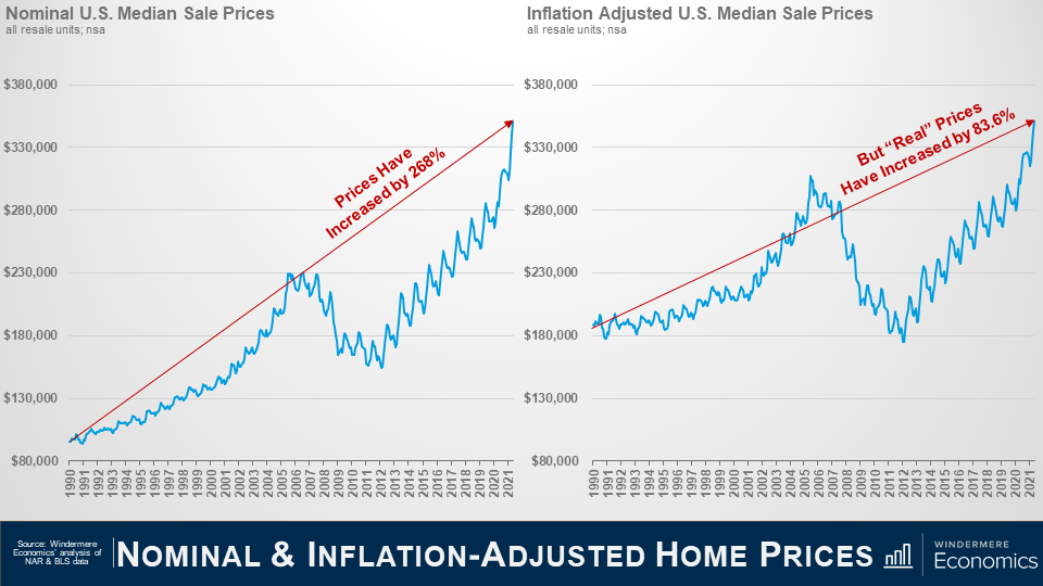
This slide shows nominal median sale price over time—its chart we started out with. And when I use the term “nominal”, it means that it’s not adjusted for inflation and therefore the value of each dollar spent on housing was actually depreciating over time because of inflation.
And we know that prices are up by 268% over the past 30+ years—a very significant increase. But what happens when you adjust sale prices to account for inflation?
That’s right! Real prices are certainly higher, but by a more modest 83.6%.
So, we know that prices are higher than they were three decades ago but, in reality, the real increase is significantly lower than most people are talking about today.
The compounded annual growth rate—unadjusted for inflation—was over 4%; but when you adjust for inflation, the REAL rate was just 2%.
But there’s another factor which we need to consider when we are thinking about home price growth, so now we need to bring mortgage rates back into the equation.
I know we’ve already discussed the fact that rates dropping helped prices to rise at well above the long-term average, but now we need to look at what happens to mortgage “payments” when we use inflation-adjusted home prices.
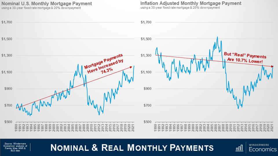
For comparison purposes, you are looking at the monthly mortgage payment for a median priced home in the US—using the average conventional mortgage rate during that month and assuming a 20% down payment.
From 1990 until today, P&I (principal & interest) payments are up by a bit more than 74%.
Of course, I am sure that there are some of you out there again crying “foul” because I am using a high downpayment but, in reality, it really makes no difference to the percentage increase in payments. You see, whatever the downpayment a buyer uses, the percentage change is actually the same.
Anyway, monthly P&I payments—in nominal terms—have risen by 74.3% BUT, what happens when you use the same mortgage rates, but to buy a home where the value has been adjusted to account for inflation?
That’s right…. “Real”—or inflation-adjusted mortgage payments—are almost 11% LOWER today than they were back in 1990 and, as you can see, significantly lower than they were during the “bubble” days.
Now, I fully understand that this is not a perfect analysis.
Monthly housing costs don’t just include mortgage payments, but they also include property taxes and insurance, both of which—unfortunately—don’t fall even if mortgage rates do!
Additionally, it does not address prices changes due to over or undersupply in any one market, and it also can’t address the impacts of changing lending policies.
But, that said, I stand by my belief that prices have been able to rise so significantly because mortgage rates have dropped AND because inflation-adjusted house prices really haven’t skyrocketed—contrary to popular opinion.
But, of course, all real estate is local, and although the numbers I’ve shared with you today might be comforting when you read articles from the “bubble-heads” out there, I must tell you that there are some markets across the country where the picture isn’t quite as rosy.
In these areas prices have risen significantly more than the national average so, even when you adjust sale prices for inflation, mortgage payments are a lot higher today than they were three decades ago.
And it is these markets that will be impacted when mortgage rates start to trend higher—which they surely will—and growing affordability constraints further limit the number potential buyers.
The bottom line is, as far as I am concerned, there are quantifiable reasons to believe that we are not in a national housing bubble today, but some markets will experience a significant slowdown in price growth given where prices are today in concert with the specter of rising mortgage rates.
So! there you have it.
I certainly hope that you found this topic as interesting as I do!
As always, if you have any questions or comments about inflation and home values, I would love to hear from you but—in the meantime—stay safe out there, and I look forward to talking to you all again, next month.
Bye now.
 Facebook
 X
X
 Pinterest
 Copy Link
