
 Facebook
 X
X
 Pinterest
 Copy Link

The following analysis of select counties of the Utah real estate market is provided by Windermere Real Estate Chief Economist Matthew Gardner. We hope that this information may assist you with making better-informed real estate decisions. For further information about the housing market in your area, please don’t hesitate to contact your Windermere Real Estate agent.
Regional Economic Overview
Utah’s impressive post-COVID job recovery continues unabated. In the first quarter Gardner Report, I reported that the state had not only recovered all the jobs that were lost due to the pandemic, but employment was continuing to rise. This trend has continued. With 96,400 jobs added over the past year and 14,500 over the past quarter, total employment is now 26,900 jobs higher than the pre-pandemic peak. The only other state in the country that has recovered all the jobs lost due to COVID is Idaho. With a full recovery in the job market, it’s no surprise the jobless rate dropped further to 2.7% in June—its lowest level since March 2020 and the second-lowest rate in the nation; only Nebraska is lower at 2.5%.
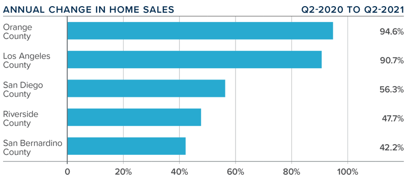
utah Home Sales
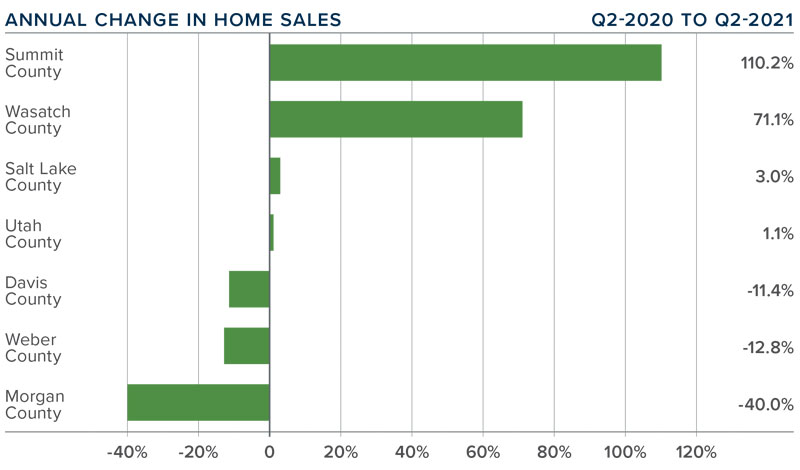
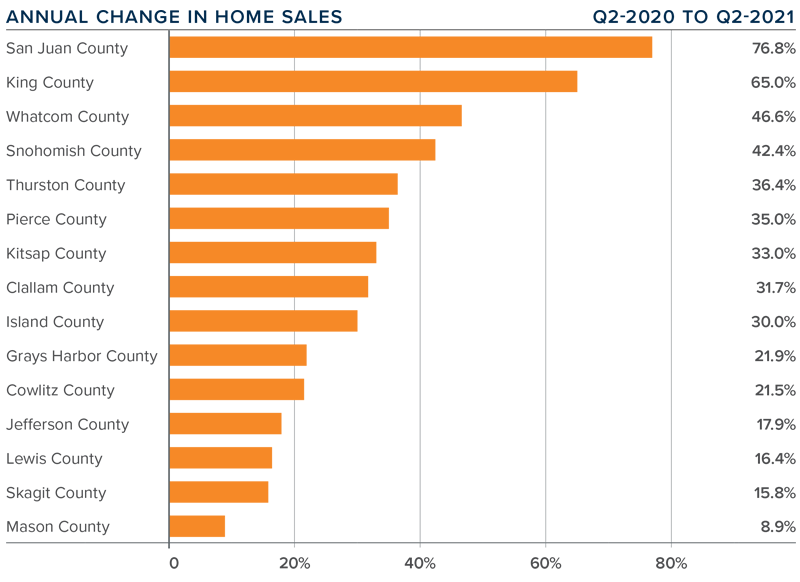
❱ In the second quarter of 2021, 9,689 homes sold, representing a modest 1.2% increase year over year, and a very significant 42% increase compared to the first quarter of the year.
❱ Sales activity rose in four counties but dropped in three. Summit County saw a massive increase in sales. Wasatch County also saw impressive gains. Sales dropped most in Morgan County, but because this is a very small market I’m not concerned.
❱ What aided the jump in sales from the first quarter was an increase in listing activity. Inventory of available homes rose more than 50% compared to the first quarter. Although this is good news, listing activity is still down more than 55% from this time a year ago.
❱ Pending sales rose across the board compared to the first quarter, with significant increases in Utah, Davis, Salt Lake, and Wasatch counties. With pending sales up more than 30% from the prior quarter, there will likely be solid growth in closed sales in the upcoming quarter.
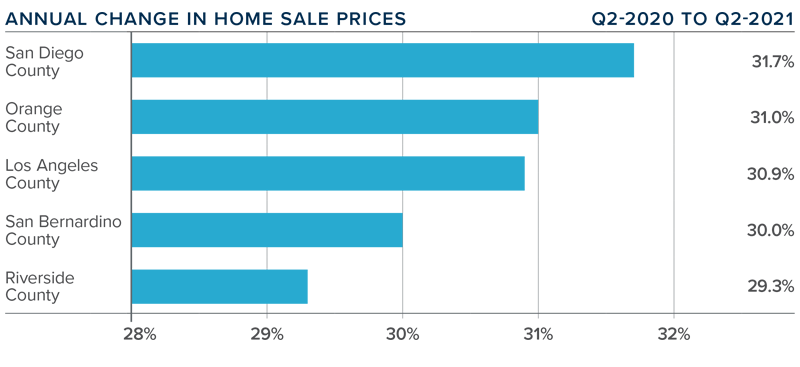
utah Home Prices
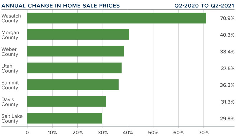
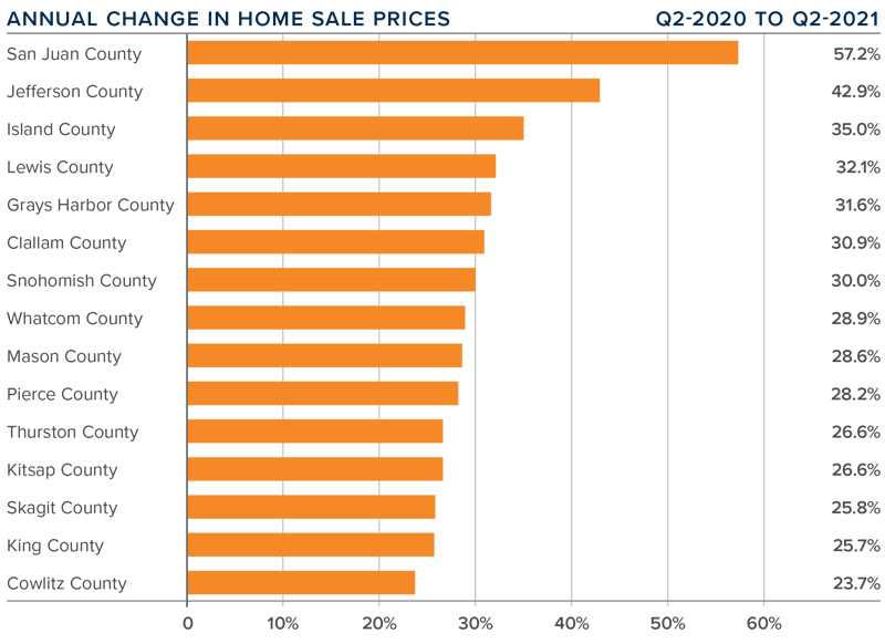
❱ A rock-solid economy and low mortgage rates had buyers out in force. That said, even with supply levels improving, demand is still outpacing supply, which has led to significant price gains. Year over year, the average home price in the region rose 41.8% to $578,648. Prices were 8% higher than in the first quarter of 2021.
❱ Although the data shows remarkable home price growth, the pandemic had a significant impact on housing during the second quarter of last year. As such, I anticipate the yearly change in prices will soften in the third quarter but remain well above the long-term average.
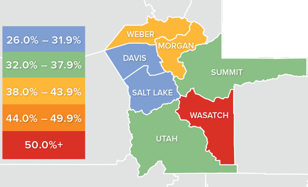
❱ Home price growth was led by Wasatch County, but rose by very significant rates across all the counties contained in this report. Of note is that Summit and Wasatch counties saw average sale prices above the $1 million level in the second quarter.
❱ The takeaway here is that, while the number of homes on the market did improve relative to the previous quarter, there continues to be a shortfall in inventory, which has led prices to rise at a significant pace.
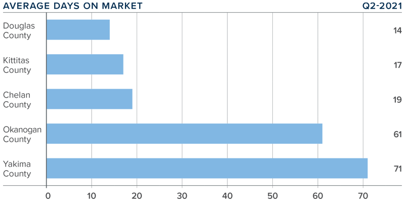
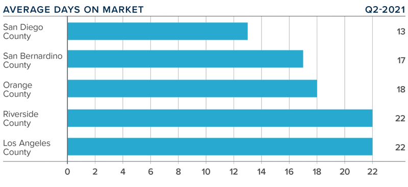
Days on Market
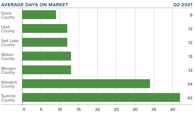
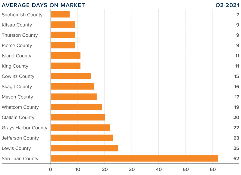
❱ The average number of days it took to sell a home in the counties covered by this report dropped 28 days compared to the second quarter of 2020.
❱ Homes sold fastest in Davis County, with sales occurring in less than two weeks in an additional four counties. The greatest drop in market time was in Summit County, where it took 63 fewer days to sell a home than it did a year ago.
❱ During the second quarter, it took an average of only 19 days to sell a home in the region, which is down 14 days compared to the first quarter of this year.
❱ Days-on-market data provided further proof of the supply/demand imbalance mentioned throughout this report. Unfortunately, I do not see any signs of supply levels rising enough to meet buyer demand.
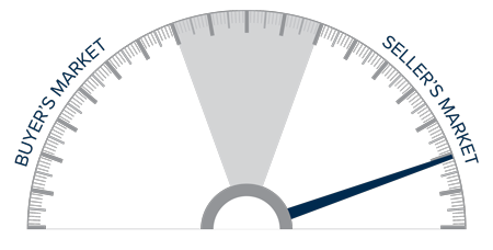
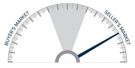
Conclusions
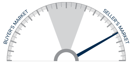
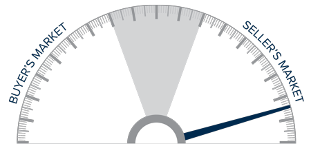
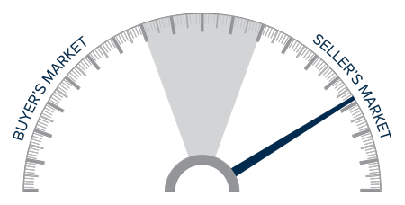
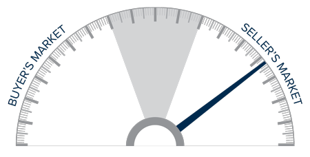
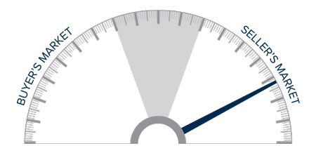
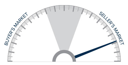
This speedometer reflects the state of the region’s real estate market using housing inventory, price gains, home sales, interest rates, and larger economic factors.
Strong economic growth—in concert with persistently low mortgage rates—continues to drive housing demand. Even with the increase in listings in the second quarter, many buyers are frustrated by the level of competition for the homes that are for sale.
It remains, undeniably, a seller’s market, and I have therefore moved the needle a little more in their favor.
About Matthew Gardner

As Chief Economist for Windermere Real Estate, Matthew Gardner is responsible for analyzing and interpreting economic data and its impact on the real estate market on both a local and national level. Matthew has over 30 years of professional experience both in the U.S. and U.K.
In addition to his day-to-day responsibilities, Matthew sits on the Washington State Governors Council of Economic Advisors; chairs the Board of Trustees at the Washington Center for Real Estate Research at the University of Washington; and is an Advisory Board Member at the Runstad Center for Real Estate Studies at the University of Washington where he also lectures in real estate economics.


")


