Market News June 8, 2021

Matthew Gardner: What You Should Know About Today’s Real Estate Market


Understanding the housing market is a matter of analyzing its many data sets. In a recent piece for Inman News, Windermere Chief Economist Matthew Gardner offered his perspective on recent U.S. pending sales, new-home sales, and existing-home sales figures.

If you’re involved in the housing market, and I assume that most of you are, you know very well that this is a numbers business. All of us are surrounded by housing-related data day in and day out, and it can become a little overwhelming at times — even for an economist like myself.

Well, today I’d like to take a few minutes to talk about just a couple of the datasets that I think are particularly important to track and offer you my perspectives on them.

Housing

There’s no doubt that the ownership housing market really was a beacon of light as we moved through the pandemic period. Even though the market paused last spring as COVID-19 hit the nation, it snapped back remarkably quickly, unlike many other parts of the U.S. economy that are still suffering today.

This is important, as housing is a significant contributor to the broader economy. For example, last year, spending on the construction of new homes, residential remodeling and real estate brokers fees amounted to around $885 billion or 4.2 percent of gross domestic product.

But the real number is far greater than that when you add in all spending on all household services. The total amount of money spent on housing in aggregate was around $3.7 trillion or 17.5 percent of the country’s economy.

So, we know that the housing market is a very important part of our economy, but can that number continue to grow? Let’s take a look.

Inventory

The chart below shows the number of single-family homes for sale going back to 1983. As you can clearly see, there’s never been a time — at least since records were kept at the national level — where they were fewer homes for sale at any one time.


Line graph titled “inventory of homes for sale” along the x axis are the Months starting with January 1983 and ending with August 2020. On the y axis is 0 through 4. The line shows that in August 2020 there are fewer homes on the market than ever before. Source is NAR with Windermere Economics seasonal adjustments.


And this is a problem because the biggest issue the market faces today is that demand for homes is far exceeding supply.

A report I track very carefully — and I am sure that many of you do, too — is the National Association of Realtors pending home sales index, which is shown below.

Although it’s not a perfect indicator, as the survey only covers about 20 percent of all homes that go pending, it does give us a pretty good idea as to what the future may hold given that, all things being equal, about 80 percent of pending homes close within roughly two months, making it a leading indicator.


Line graph titled “Pending Home Sales Index” that shows the 12-month percentage change, seasonally adjusted. Along the x axis are months from January 2019 to March 2021. On the y axis is percentages from -40% to +30% with a line through the graph marking 0%. The line shows a significant decreased in April 2020 from 10% in February 2020 to -35% in April 2020, then a quick recover peaking around 25% in August 2020. Source NAR.


You can clearly see the massive pull back last spring because of the pandemic, but this was very quickly followed by a very significant surge.

It pulled back again last winter, but I would suggest that this was more a function of lack of homes for sale than anything else. However, look at the March spike.

Now, you might be thinking that this is a great number, but I would caution all of you not to pay too much attention to year-over-year changes, as they can be deceiving. You see, the index jumped because it was being compared with last March when the pandemic really started.

Closed Sales

When we look at closed sales activity, it actually lines up pretty well with the pending home sales index, which fell in January and February. This is reflected in the contraction in closed sales that we saw this spring. And if the index is accurate, it suggests we may see closed sales activity pick up again over the next couple of months.


Line graph titled “Existing Home Sales” in millions seasonally adjusted. Along the x axis is months from January 2021 and April 2021. On the Y axis is numbers between 3.0 and 7.0, increasing by half points. The line shows a sharp decrease in April 2020 and a quick recover with a peak at 6.7 in October 2020. Source is NAR.


Of course, any time where housing demand exceeds supply, there is a solution — and that would be to build more homes.

But as you can see here, though more homes started to be built as we emerged from the financial crisis, the number today is essentially the same as it was two decades ago and has been declining for the past two years.


Two line graphs next to each other, the slide is titled “New Homes for Sale” on the left is Single Family New Homes for Sale in the US in thousands, seasonally adjusted. Along the x axis is years from 2000 to 2020 and on the y axis is numbers from 0 to 700 in increments of 100. This graph shows a peak between 2006 and 2008 just under 600, with a sharp decline after that, the lowest point in 2021. With some recover, the line peaks again in 2020 just above 300. On the right is New Homes for Sale by Stage of Construction. The light blue line is not-started, the green line is completed, and the navy blue line is under construction. Not-started is consistently the lowest number between 2000 and 2018, but in 2019 it rises above the green line. The navy blue line is consistently on the top of the graph, which a small dip that goes below the green line in 2009. Source: Census Bureau.


That’s significant, as the country has added over 12 million new households during the same period which has further fueled demand for housing. If there are no new homes to buy, well, that does one thing — and that’s to put more focus on the resale market, which has already led to very significant price increases.

New Home Market

But this particular report also offers some additional data sets, which I think give more clarity to the state of the new home market.

Before the housing market crashed, you can see that a majority of new homes that were on the market for sale were being built at that time, but — as the housing bubble was bursting — the market dropped, and the share of homes that were finished and for sale naturally rose.

But what I want you to look at is the far right of the chart above. You see the spike in the share of homes for sale that have not yet been started?

Well, given the massive increase in construction costs builders have, understandably, become far more cautious and are trying to sell more homes before they start to build them to mitigate some of the risk. It also tells me that they see demand that is not being met by the existing-home market and are looking to take it advantage of this.

When we look at new home sales, you can see that the trend, in essence, follows the number of homes for sale, but I would caution you on a couple of things.


Two graphs side by side, the slide is titled “New Home Sales” on the left is a line graph of us single family new home sales in thousands. On the x axis is dates from 2006 to 2020 and on the y axis is numbers from 0 to 1,600 in increments of 200. The line shows the peak in 2006 at 1,400 with a sharp decline afterwards until it bottoms out in 2010 at around 200. From there there’s a slow recover, with a peak in 2021 at around 1,000. On the right is a clustered column graph titled New Homes Sold by Stage of Construction. The green bars represent not started, the light blue columns represent under construction, and orange shows the completed projects. On the x axis is months from January 2020 to April 2021 and on the y axis I percentages from 20% to 45% in 5% increments. From Jan 2020 to July 2020 the orange bars representing completed are the highest bars, but from August 2020 to March 2021, the blue bars are the highest showing that homes under construction were the most common new homes purchased. Source: Census Bureau.


Firstly, these figures do not represent closed sales, as the Census Bureau, which prepares this dataset, considers a home sold once it has gone under contract. This makes sense, as a home can be sold before it has even broken ground. In essence, it’s more similar to NAR’s Pending Home Sales Index than anything else.

Look now at sales by stage of construction on the right. You can see that, as the pandemic was getting started, new homes that were ready to move into were what buyers wanted, and that accounted for over 42 percent of total new sales in April.

As the supply of finished homes dropped, homes that were being built took the lion’s share of sales — as they have done historically. However, look at April. The greatest share of sales — 37.7 percent — were homes that hadn’t yet been started.

Again, this supports the theory that builders remain cautious given ever-escalating costs, but it also shows that buyers’ needs are not being met by the resale market, so they were willing to wait, likely a considerable time, for their new home to be built.

Of course, the couple of datasets I’ve shared with you today are just the tip of the iceberg when it comes to the housing-related numbers you should all be tracking, as they can tell a story that can impact everyone involved in the development or sale of homes.

Mortgage Rates

In addition to the data we have discussed today, you should be well versed in mortgage rate trends, demographic shifts, building permit activity and the economy in general — and you need to understand all these numbers at a local as well as national level.

For the vast majority of households, buying a home will be the most expensive thing that they will ever purchase in their lives. And given memories of the housing crash, as well as the significant increase in home prices that we’ve seen since last summer, it’s now more important than ever for you to be able to share your knowledge with your clients and be able to advise them accordingly.


Windermere’s Chief Economist, Matthew Gardner, often contributes to local and national publications with his insights to the housing market. Recently he offered his analysis of home sales numbers to Inman News, this is a repost of that video and article.

For more market news and updates from Matthew Gardner,

visit our Market Update page.

Buying June 7, 2021

5 Mistakes to Avoid After Pre-Approval

Getting pre-approved is a great first step for buyers, but there can be a number of hurdles in the process. Here are a few cautionary steps that can be taken to make the experience as smooth and worry-free as possible.

Pre-Approval

Getting pre-approved has many benefits for buyers: it strengthens their buying power, assists in identifying their price range, helps communicate their preparedness to sellers, and, once their offer is accepted, helps to speed up the closing process.

Pre-approval is broken down into two steps: pre-qualification and pre-approval. During pre-qualification, buyers will share their financial information with their bank or lender to understand the approximate loan amount they can expect to qualify for. The pre-approval process is a little more involved, as the lender will conduct a thorough review of the buyer’s financial health to give them a more detailed picture of how much they can borrow, estimated monthly costs, and what interest rate they can expect on their loan.


A woman holds a tablet, analyzing her finances.

Image Source: Getty Images


5 Mistakes to Avoid After Pre-Approval

Being pre-approved doesn’t mean buyers are all set. There are certain mistakes that can throw buyers off course, and in some cases, lead to a denial of financing. Here are five common mistakes that can do just that:

  1. Large Purchases

    Any large purchases—credit or cash—made after getting pre-approved can easily cause trouble for buyers. Making a large credit purchase equates to increasing debt, which raises a buyer’s debt-to-income ratio. Large cash purchases decrease a buyer’s cash-readiness from the time when they were pre-approved. In both scenarios, the lender may call into question a buyer’s ability to make their mortgage payments.

  1. Quitting or Changing Jobs

    Knowing that a buyer has a stable source of income is important to lenders. Accordingly, it is best for a buyer to wait until after the home loan process is complete before taking steps to change their employment. Not only could changing jobs potentially put their mortgage pre-approval at risk, but it could also delay their settlement, since it takes time to prove a new salary.

  1. Unpaid Bills

    Missing bill payments can be especially harmful to a buyer’s candidacy in the time between getting pre-approved and closing on the home. During pre-approval, lenders are using your ability to pay bills on time to help them paint a picture of your finances and it’s important to keep that picture consistent. 

  1. New Credit

    Opening new credit accounts will likely change a buyer’s credit score, which may cause adjustments in their interest rate. Lenders, upon seeing a new line of credit, even a store credit card, may elect to review the buyer’s risk of non-payment.

  1. Paying Off Debt

    While most people would think paying off debt is a good thing, if a buyer pays off any significant loans or credit card debt after pre-approval, their lender will want to know where the money came from. The decrease in debt will also have an effect on the buyer’s debt-to-income ratio, which may alter their creditworthiness.

The period of time between pre-approval and closing on a home can be a tedious one for buyers. Before making any significant financial decisions, it’s helpful for buyers to speak with their lender to get an idea of how it may impact their financial standing. The complexities of this process also highlight the importance of working with an experienced agent.

For assistance planning a home purchase, connect with a Windermere Real Estate agent here:

Selling June 4, 2021

Preparing Your Equestrian Property for Sale

Selling a horse property is quite different to selling your typical single-family home and can present some unique challenges. Therefore, when marketing a property like this, there are certain things to consider in order to achieve a successful sale. Because equestrian properties aren’t usually located in heavily populated areas, when buyers take the time to visit your property, you need to do everything you can to make a lasting impression. Having an equestrian property is a major responsibility, but if you convey to interested buyers the value and joy it can bring, it will help with getting your property sold. Here are some ways you can prepare your equestrian property for sale.

Sell the Lifestyle

How your property is described and positioned in the marketing assets is key. You are selling a lifestyle, so it’s worthwhile to talk up the experience that comes from owning such a unique property. Elaborate on nearby vets, feed lots, co-ops and grocery stores. Describe the nearby trail rides and point out if there are neighborhood riding clubs.  Paint the picture of what a potential buyer’s life could look like when they buy your property. Will they be enjoying the sunset on the patio overlooking the pasture? Does a stream trickle by the patio creating a relaxing ambiance? Can you watch the horses play in the field from the bedroom window? These are the visuals images that can capture a buyer’s imagination.

Organize your Documents

There are certain legal documents and records that come with owning and operating an equestrian property. Make sure you have the title and any land surveys or improvement location certificates ready to go as you prepare the property for sale. In addition to legal documents, make sure your agricultural records are current and updated. This includes plant health analyses, well permits, water or mineral rights, grazing leases or anything relating to natural resources on your property. Many buyers will ask to see records of past water and utility bills as well. This will make the process that much easier when you know the logistics have been taken care of.

Stage for Buyers

More than likely, the buyers who are touring your property either own horses or have been around equestrian properties before. Therefore, you will want to make sure the property appeals to horse owners. This includes making sure your fencing is intact, locks are secure, the barn is clean, and the pastures are mowed to perfection. This will also show buyers that they too can make the property look exactly the way they envision.

The Price is Right

A major factor in attracting buyers is the listing price. It’s important to work closely with an Equestrian Advisor who specializes in selling horse properties to ensure that yours is priced accurately. When potential buyers see that your equestrian property is properly priced, they are more likely to view it as a good investment. If you plan to include any equipment like a tractor, mower or other large items in the sale, price those separately and do not include them in the list price of your home. This will ensure that your property is listed at an appropriate price and that buyers will pay the necessary sales tax on those items outside of closing.

Selling June 2, 2021

Selling a Home with Pets

For pet owners, it’s hard to imagine their home without a furry friend. However, when it comes time to sell, showcasing the qualities of a home should take precedence over the pets that live in it. This creates additional steps in the process of preparing your home for sale, but it makes all the difference in the minds of buyers.

Selling a Home with Pets

Staging Your Home

A well-staged home makes it appealing to the widest variety of buyers and has significant ROI potential when it hits the market. However, having a pet can complicate the staging process. Buyers may lose interest in the home if they see traces of pets, so it’s a good idea to hide any and all signs of their presence.

It’s especially important to hide evidence of your pet in marketing photos. Prepare for your home’s listing photos by cleaning and vacuuming, making sure all pet stains are gone and any pet-related damage is repaired. Stow any pet carriers, cages, toys, food bowls, and other supplies that may hinder the photographer’s ability to capture the essence of a room.

Showing Your Home

Before inviting potential buyers inside, it’s best to give your home a deep clean to improve your home’s air quality, and to rid your carpets, flooring, and surfaces of pet odors and any dirt they may have tracked in over time. If you’re using your own furniture, vacuum and clean everything to extract as much fur and pet dander as possible. Talk to your agent to see if it’s a better idea to stage your home with rented furniture. If your pets have caused any damage in the home, make repairs or replacements as needed. After tending to your home’s interior, don’t forget to clean up after your pets in your yard as well. Fill in any holes in the lawn, freshen up your flower beds, and tidy up any areas of the landscaping where your pets may have dug.

After you’ve prepared your home for showings, there’s the question of what to do with your pets once buyers actually start taking tours. Ask a family member, friend, pet sitter, or neighbor to watch your pets while the showings take place. If you’re not able to find someone to watch them, form a strategy to temporarily relocate your pets during showings. If they must stay in the home, garage, or backyard during tours, it’s best to give buyers advanced notice that there are pets on the property. Talk to your agent about posting signage communicating their presence so that there are no surprises as guests make their way through the house.

Taking all these precautions will help to present your home in the best light without detracting certain buyers, for whom the signs of a pet may cause them to lose interest. On the other hand, if any buyers inquire about how the home can accommodate their pet, you and your agent will be more than ready to answer any questions they may have.

Selling Your Home

For more information on the process of selling your home, visit the Selling Page on our blog. To get an idea of what your home is worth, try our free home value calculator below:

What Is My Home Worth?

Design May 26, 2021

7 Weekend Home Projects

So many projects, so little time. That tends to be the mantra for homeowners with an ever-growing to-do list and limited availability to accomplish their tasks. Fortunately, the weekend is an opportunity to dig into certain projects and see them to their completion by the time the weekdays come around again. These seven weekend home projects can be accomplished within a couple of days and will make a dent in your to-do list.

7 Weekend Home Projects

1. Upgrade Your Kitchen Cabinets

Giving your kitchen cabinets a facelift is a simple way to give your kitchen a makeover. When staining wood cabinets, begin by removing the cabinet doors and hardware, then wipe the doors to clear away and dust and dirt. After applying and removing wood stripper, sand the doors to get them primed and ready for a new stain. When painting cabinets, choose a color that works well with your appliances. As you pack up the contents of the cabinets keep your most frequently used items nearby so you can access them during your  project. To add a finishing touch to your weekend cabinet makeover, shop around for new hardware and drawer inserts.


A kitchen with dark blue cabinets and white tile.

Image Source: Getty Images


2. Refresh Your Front Entry

Your home’s front entry is the key to making a lasting first impression and helps to enhance your curb appeal. Make a statement by giving your front door a fresh coat of boldly colored paint, look for stylish house numbers, and add classic front entry elements like a sitting bench or swing for ultimate comfort.

3. Improve Your Home Office

Whether you work remotely or in person, much can be done in a weekend to improve the functionality of your home office. Creating an environment conducive to your productivity helps to separate your office from the rest of your home, maintaining a balance between your work life and your home life. Situate your desk near a window to attract natural light. If the room has no windows, orient your seating so you’re facing the open space of the room. Experiment with therapy lights, ergonomic chairs, and soothing décor to make your office as comfortable as can be.

4. Curate Your Bathroom

In one weekend your bathroom can be transformed into a sanctuary of self-care. Refinishing your tub is a cost-effective alternative to a replacement. Start by removing any and all hardware, then sand the whole surface, filling in any cracks or holes with putty. Once you’ve sanded down the putty, apply multiple layers of primer and topcoat following the manufacturer’s instructions and buff the surface. Replace your vanity’s cabinet hardware and drawer pulls, matching them with your shower rod, faucet and shower head to tie the room together. Switch out your shower curtain and carpets for bold colors to liven up the space or choose neutral tones to create an organic feel.


A bathroom with a dark blue vanity, white walls, and white tile.

Image Source: Getty Images


5. Organize Room-By-Room

Spending a weekend organizing each room of the house is sure to make a big difference in the look and feel of your home. Bookcases and coffee tables are magnets for clutter in the living room. Start by emptying everything and sort the items into three piles: keep, dispose, donate, (this method of organization will do wonders for your closets and bedroom as well), and invest in storage bins to keep the space tidy. In the bathroom, organize the medicine cabinet and vanity drawers first. Get rid of expired medication, makeup, and toiletries. Take the same approach to your shower. Once you’ve gone through everything, reassess your shower shelving to fit your newly organized inventory. After working your way through your kitchen cabinets, consider either a hanging or wall-mounted pot and pan rack to save space.

6. Fix Up Your Fence

Whether your fence needs a simple wash, a new sealant or stain, or repair, tending to it will freshen up your yard while also extending the life of your fence. Power washers are a helpful tool in getting your fence clean before re-staining, but a sprayer that’s too powerful could damage the wood. Let the fence dry for one to two days before applying the stain. As long as any damage that needs repair is contained to a section of the fence, a weekend should be plenty of time to get it fixed. To replace any damaged rails, pry them off their posts with a crowbar or cut the damaged section out with a handsaw. When repairing fence posts, be sure to remove any rails that are connected to it.

7. Build a Fire Pit

Common fire pit materials include brick, stone, or cinder blocks. Outline your fire pit before you start digging. Once the hole is dug six to eight inches deep, fill in the hole with gravel until it is level with the ground. Choose your materials, fix the stones into the ground, compact them together, and enjoy your time by the fire. Check for local burn bans or regulations.

Market News May 24, 2021

5/24/2021 Housing and Economic Update from Matthew Gardner

This video is the latest in our Monday with Matthew series with Windermere Chief Economist Matthew Gardner. In this month’s special episode, Matthew takes a deep dive into the data that helped him shape his Op-Ed piece for Inman News. 


Hello there! I’m Windermere Real Estate’s Chief Economist, Matthew Gardner, and welcome to a rather special episode of Mondays with Matthew.

Why special? Well, regular viewers of my videos will know that I generally take this opportunity to give you an update on the housing related numbers that came out in the month, but this time we are going to go in a different direction.

A few weeks ago, I was asked by the real estate publication, Inman, to pen an op-ed that would offer a counterpoint to this one which they had just published.

Well, I think that many of you will agree that it’s a pretty direct position and – judging by the comments I read following its publication – was certainly one where readers were very firmly on one side of the fence or the other!

Those of you that know me at all will probably have already figured out my position on this. I went ahead and crafted my response and I do take a different view on the matter!

As I am sure that some of you don’t have access to Inman’s website, I thought it might be interesting to share with you the reasoning behind my belief that we are not about to enter a period of declining home values; but even if you are an Inman subscriber and did read the piece, I hope that you will still find this video worth watching as I will also be sharing some of the background data with you that was not included in the article, as well as to give some more context on the subject.

Home Prices Out-Pace Wages

But to start with, I must acknowledge the fact that home prices have been rising at a significantly faster pace than wages for several years now and that may well be part of the reason why some people in the industry – and some perspective home buyers – are getting concerned.


Two bar graphs side by side. On the left is the Average Weekly Wage between 2012 and 2021. Each year the bar grows, and a trendline above the bars includes text that reads: “Wages Have Risen by More than 30%. On the Right is the existing home sale price per year from 2012 to 2021. Each year the bar grows a little more and a trend line above reads “But Home Prices are up by 113%” The data sources are Windermere Economic’s analysis of N.A.R. and B.L.S.


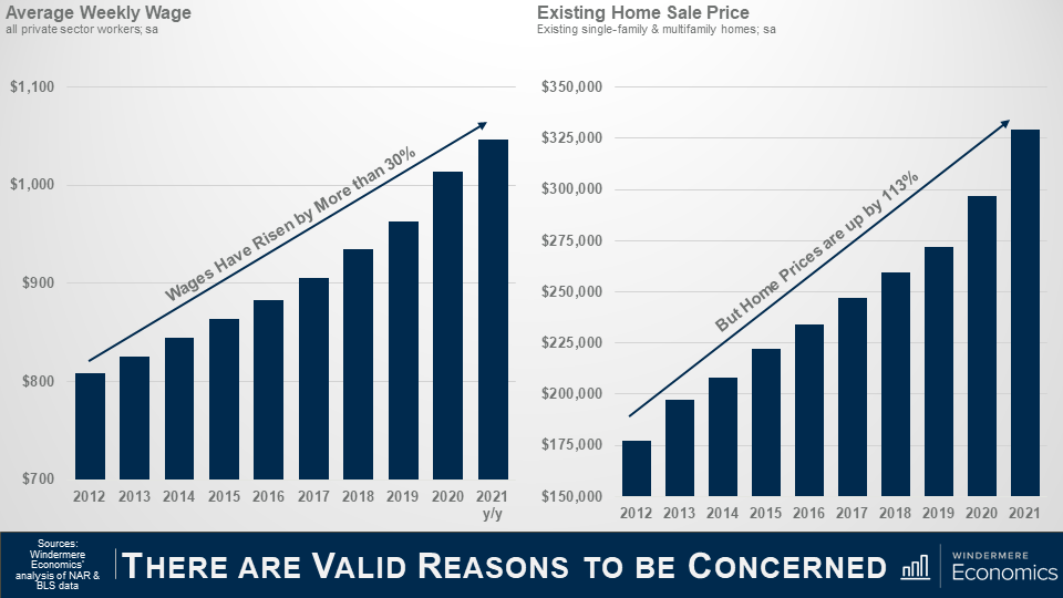
As you can see here, since 2012, average weekly wages have risen by a little more than 30%, with the average annual gain of around 2.3% which is actually not that bad. Wages also rose by over 6% last year, which sounds great, but in reality, it was because of the pandemic.  You see, most of the job losses were in low-wage sectors which skewed the data upward – but I digress.

Anyway, during the same time period, you will see that even as wages rose, home prices have taken off and wage growth has simply not kept pace.

I often think about a quote from the Spanish philosopher and novelist, George Santayana, “Those who cannot remember the past are condemned to repeat it” which I think just about says it all!

Timeline

So, what we are going to do today is to take a look back and run through a brief timeline of events that led to the 2007 crash, and then look at where we are today and how it is totally different which leads me to speculate that there is no real reason why we should expect to see a widespread, systematic decline in home prices in the foreseeable future.


Line graph titled “The Case Shiller National Index” the line steadily increases a little bit between January 1991 and January 1999, but starts to increase more in the 2000’s, peaking in January 2006 and is starting to decline in January 2007 and 2008.The Source is the S&P Case Shiller.


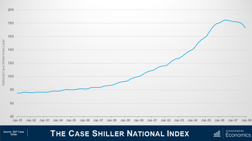
This first chart shows the Case Shiller National Home Price Index level over time and we’ll be using it as a base for this part of the discussion.

If you are not familiar with Case Shiller, its what’s known as a repeat sales index – which means that it looks at the change in sale prices between when a home was purchased and when it was sold and is a great way to look at changes in home prices.


GIF of Case Shiller Index Timeline of the Housing Market from 1990 to 2008


Let’s start all the way back to the early 1990’s.

1992

In ’92, Congress enacted Title 13 of the Housing and Community Development Act and they did this to give low- and moderate-income borrowers better access to mortgage credit via loans supported by Fannie Mae and Freddie Mac.

1995

And in ‘95, President Clinton introduced a National Homeownership Strategy which had a very aggressive goal of raising homeownership levels from 65.1% to 67.5% by the year 2000 – that would be a rate of ownership in America that had never been seen before.

But this could only realistically happen if Fannie & Freddie significantly increased the share of mortgage funds going to lower income households. The Housing and Community Development Act required them to dedicate 30% of their portfolio to lower income borrowers – but the Clinton plan meant that they had to raise that share to 42%.

And it started out rather well with almost 2.8 million new homeowners created between 1993 and 1995 – and that was double that seen during the prior two years.

And because of the increase in demand that would come from greater loan volume, Fannie and Freddie moved to an automated underwriting process to speed up loan approvals. Interestingly, this then became an industry norm – but in going to an automated model, all they really did was to significantly relax the underwriting approval process.

1999

Now moving on to the very end of the decade, in November of 1999, Congress passed, and President Clinton signed, the Gramm-Leach-Bliley Act which, amongst other things, lifted most of the restrictions that prohibited any one institution from acting as any combination of an investment bank, a commercial bank, and an insurance company that were prohibited by way of the Banking Act of 1933 – otherwise known as the Glass-Steagall Act.

Now this is important as – in essence – banks could now underwrite and sell banking, securities, and insurance products and services which included, guess what, mortgage products.

2000

In 2000, the dot-com bubble burst. Something those of us here in Seattle remember all too well – and one of the major consequences of this was that investors moved away from the equity markets and, instead, turned their attention to the real estate market.

2001

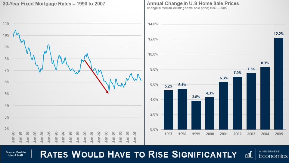
By the start of 2001, the country was heading into a recession, and even though unemployment remained close to a 30-year low, the Federal Reserve wanted to stimulate borrowing and spending, so they started to lower short-term interest rates very aggressively.

2003

As you can see, over the next 3-years the market jumped with home prices rising by 7% in 2002 and 7.5% in 2003 as more would be home buyers found easier access to mortgage credit not just from Fannie or Freddie – but all of the other institutions that could now get into the game following the passing of the Gramm Leach Bliley Act.

And because of its success, the push to expand homeownership that had started under President Clinton continued under President Bush, and he introduced a “Zero Down Payment Initiative” that allowed – under certain circumstances – removal of the 3% down payment rule for first-time home buyers using FHA-insured mortgages.

2004

Well, the Bush and Clinton administrations saw their housing goals achieved with the homeownership rate increased steadily, peaking at 69.2% of households in 2004.

Ownership rates and rapidly rising home prices were driven by one thing.

Home buyers were consuming – with relish I might add – rare mortgage products with strange-sounding names such as Alt-A, sub-prime, I-O – as in interest-only -, low-doc, no-doc, or the classic NINJA loans, NINJA being an anacronym for “no income, no job, no assets”. There were also 2–28 and 3–27 loans; liar loans; piggyback second mortgages; payment-option and even “pick-a-pay date” adjustable-rate mortgages.

What could possibly go wrong!

2005

And by 2005, sub-prime mortgages had risen from 8% of total loans made in 2003 to 20%, with about 70% of sub-prime borrowers using the hybrid 2/28 and 3/27 ARMs I just mentioned, and these were mortgages with low “teaser” rates for the first two or three years, and then they adjusted periodically.

And when you add in Alt-A mortgages, the total share of just these two mortgage products rose from 10.4% in 2003 to 39.4% in 2005.

Many people chose their financing poorly. Some clearly wanted to live beyond their means and, by mid-2005, nearly 25% of all borrowers across the country were taking out interest only home loans which gave them a lower  monthly payment, as they weren’t worried about paying down the principal because home prices were going to continue to skyrocket forever – right!!?

2006

By the end of 2006, a full 90% of all sub-prime mortgages were ARM’s and with a doubling of the sub-prime share, about $2.4 trillion of new sub-prime and non-prime mortgages were used to buy homes.

2007

Well, in 2007 over $1 trillion worth of ARM’s were about to reset, and this is what really took the market down.

Why? Well, back in July of 2004, the Fed started to raise interest rates, and with all the ARM’s starting to reset, a massive number of homeowners just couldn’t afford their new payments and they started to default in droves.

2010

The ultimate outcome was that in 2010 over 2.2% of all homes in America were foreclosed on – that almost 2.9 million homes – in just one year.

So what makes it different this time around?

That’s the history lesson, so let’s compare and contrast where we are today with what happened back then.


Two graphs side by side, titled together “Rate would have to rise significantly” the graph on the left is a line graph showing the 30-yearmortgage rates from 1990 to 2007. From 2000 to 2004, there’s a red arrow that highlight the decline in the number of mortgages. On the right is a bar graph that shows the annual change in U.S. Home sale prices changed in median existing home sale price from 1997-2005. There’s a steady increase from 1999 to 2004, and in 2005 there’s a share increase to 12.2% from 8.3% in 2004. The sources are Freddie Mac and NAR.


As we discussed earlier, the Fed started to lower interest rates following the dot-com bust and that flowed down to the mortgage market and rates also started to drop but it wasn’t just the Fed – investors did what they usually do during periods of economic uncertainty – they moved a lot of money into bonds, and this has a far more direct effect on mortgage rates.

By 2004, mortgage rates had dropped to a record low.

And as rates dropped, look what happened to prices – they started rising as buyer purchasing power rose, but that’s far from the only reason why home prices rose so significantly, but we will get to that later.


Two graphs side by side with the title at the bottom Rates would have to rise significantly. On the left is a line graph that shows the 30-year fixed mortgage rates from 2008 to now. There are two red arrows highlighting decreases, one from 2008 to 2021 that drops from above 6% to between 3%and 3.5%. The other red arrow highlights July 2018 to November 2020 that falls from 5% to just above 2.5%. On the right is a bar graph showing the annual change in U.S. home sale prices change in median existing home sale price from 2012-2020. Most of the graph sits below 8% except 2013 which is at 11.2% and 2020 is at 9.1%.


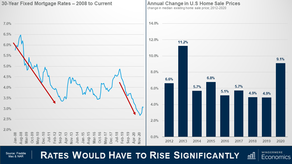
So, moving forward in time, you can see that rates dropped again as the financial crisis was taking hold and the country was entering a recession and rates dropped even more staring in 2019 as the Fed became concerned about inflation, slowing global growth, and trade wars.

And they offered further supported to the housing market at the onset of the pandemic by aggressively buy bonds which effectively lowered mortgage rates even further.

So far, you may be thinking, “well, its clearly the same as last time”, but I’m afraid that you’d be wrong.

You see, although sale prices surged in 2013 – realistically because home prices over corrected on the downside following the bubble – average annual price growth since 2013 has been slower we saw pre-bubble.

The median sale price rose by an average annual rate of 7.6% between 2000 and 2005, but between 2014 and 2020, the pace of appreciation was a full 1.5 percentage points lower.


Two area graphs side by side with the title underneath that says inventory of homes for sale. On the left the chart shows the inventory of homes for sale in the U.S in millions; single-family & multifamily units; seasonally adjusted. There’s a sharp increase from 2005 to 2007, then a decrease after that but the graph never goes back down to pre-2005 numbers. On the right the area graph shows the inventory of homes for sale in the US in millions from 2012 to 2021. The graph shows a slow decrease over time, with sharp changes between 2012 and 2013 and again from 20119 to 2021.


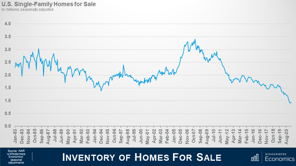
I am going to talk more about mortgages shortly, but it’s important to touch on another significant difference between the 2000’s and now and that’s housing supply.

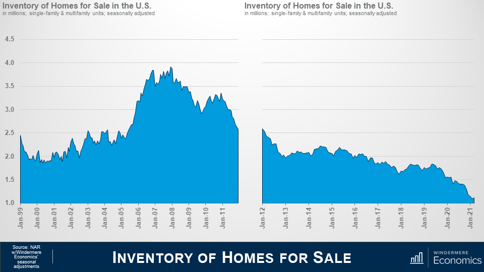
As you can see here, starting in 2001, inventory levels rose and peaked just as the bubble was about to burst. Why? Well, do you remember me telling you about the surge in unique mortgage products – specifically ARM’s?

1 in 10 borrowers in ‘05 and ‘06 took out “option ARM” loans and one-third of ARMs originated between 2004 and 2006 had “teaser” rates below 4%. Therefore, we started to see people try to sell before the rate reset and this led to the growth in listings. But how does that compare to what we’ve seen over the past several years?

The number of homes for sale has been sliding since the spring of 2011 and is currently at the lowest levels since data on total US listings started to be gathered back in 1999. Ultimately, the basic economic laws of supply and demand are working today. Prices rise on scarcity of product and lower cost of financing. Both of which we see here.


Two bar graphs next to each other with the title of the slide reading at the bottom inventory of homes for sale. On the left is the inventory of existing homes for sale quarter average comparing Q1 2005 and Q1 2021. The bar for Q1 2005 rises to between 2 and 2.5 million. The bar for Q1 2021 sits just above 1 million. On the right is a bar graph that shows the supply of new housing in millions for US housing permit issuances. The blue bars represent single-family permit and orang represents multi-family. In 2005 the blue bar for single-family homes sits at just above 1.6 million and the orang bar for multi-family sits between .4 and .6 million. In 2020, blue bar is almost half the blue bar in 2005, sitting at just under 1 million, and the orange bar sits around the same between .4 and .6 million.


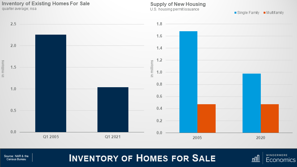
This shows the average number of existing homes that were for sale in the spring of 2005 – a date I chose as it was before the mortgage ARMS’s started to reset – and this spring.

Clearly a significant disparity. Now some of you may say that its lower because of the pandemic, but even if I were to use the spring of 2020 as a comparison – before the pandemic took hold – listings would still be 36% lower than in 2005.

But new demand can be met by building more new homes. Almost 1.7 million single family permits were issued in 2005 when the market was booming, but fewer than 1 million single family permits were issued last year.

The multifamily side is a little more complex as we cannot distinguish between condominiums and apartments, but I would suggest that although the number is pretty close to identical, the difference is that new multifamily permits last year were focused on the apartment world, whereas they were mainly condominiums back in 2005.

With low levels of existing and new homes for sale today, prices have risen significantly, but the difference I see is that during the pre-bubble years prices were climbing more as a function of speculation rather than real demand as there were significantly more homes available back then.


Line graph that shows the average home ownership tenure in the united states. A sharp increase between 2009 and 2014 shows that people are living in their homes almost double as long as they were in the early 2000’s. The source of the data is Attom Data Solutions.


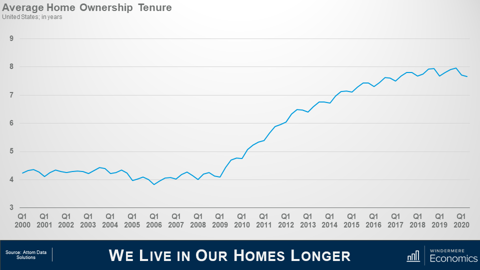
And another reason why housing supply has been so weak is that we simply aren’t moving as often as we used to.

Speculation drove home buyers to move on average every 4 or so years in the early to mid 2000’s; but look at more recent years. Mobility has dropped and we now live in our homes for twice as long as we used to and this limits housing turnover which, with the relatively low levels of new construction we just discussed, also puts upward pricing pressure on housing as supply levels stay low.


Two bar graphs next to each other, the slide title is household formations. On the left is a bar graph titled Total Households in the United States in thousands. The graph shows data from 2000 to 2006 and has a red trend line showing the increase of the bars. The line has text that says 3.9 million new households formed. On the right is another bar graph showing the total households in the united stats from 2014 to 2020. The red trend lines shows that 10.5 million new households were formed in that period. Data source is the Census Bureau.


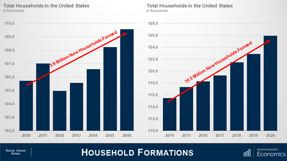
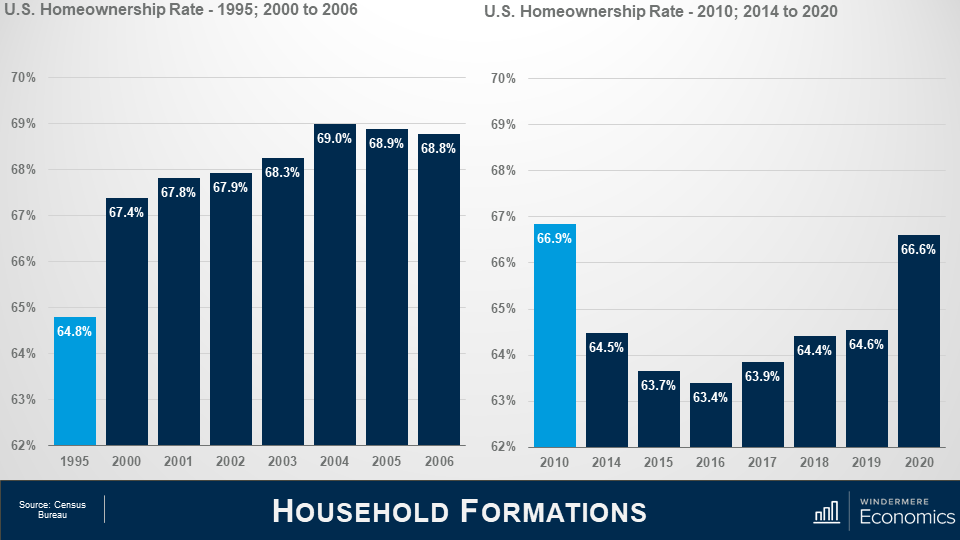
On the demand side of the equation, Census data shows that 3.8 million new households were formed in the United States between 2000 2006 which is a decent enough number.

But between 2014 and 2020, we added 10.5 million new households.

Now of course not all newly formed households become home buyers. I totally understand that. But we know that the long-term average homeownership rates in America is around 65% so it’s easy to extrapolate the numbers and conclude that demand for ownership housing continues to far exceed supply.


Two bar graphs next to each other, the title of the slide is household formations. On the left is a bar graph that shows the U.S. homeownership rate in 1995, and 2000 to 2006. 1995 is highlighted in light blue, and the bar graph represents 64.8% whereas the other bars are all above 67%, with a top number in 2014 at 69%. On the right is a bar graph that shows the US homeownership rate in 2010 and from 2014 to 2020. 2010 is highlighted with a light blue bar that shows 66.9% whereas the rest of the bars trend under 65% expect for 2020 which has a sharp increase from 2019 at 66.6%. Data source is the Census Bureau.


And talking about the ownership rate, some think that it is rising too fast – and that is proof that a speculative bubble is in place but look at this.

The pre-bubble period saw the ownership rate start to skyrocket, ultimately hitting an all-time high in 2004.

The rate was still elevated in 2010 and did not reach a bottom until 2016, but even though it has risen since, it remains well below the level seen in ’04.

Oh! If you are wondering about the 2020 spike, well I would take that with a pinch of salt. I say this as the Census Bureau survey in the first two quarters of last year were significantly affected by COVID-19 and I believe that the ownership rate was overestimated.

In fact, data for the first quarter of this year shows the ownership rate at 65.6% which is more realistic.

So, I think this clearly shows that although we continue to add households, we have not seen a speculatively driven spike in the ownership rate similar to the one we saw as the bubble was forming.

Well so far, we’ve looked at the supply of homes and how that has impacted the increase in housing prices; how demand continues to rise as more new households are formed; and we also covered the impact mortgage rates has had on home prices.

The Financing Side of the Equation

I promised you earlier that we would be returning to the financing side of the equation, because it is clear to me that it was the chief culprit behind the housing bubble.


Two graphs next to each other, the slide is titled Existing Home Prices. On the left is a line graph titled Media FICO Score for Home Buyer. There’s a significant drop in credit quality in the early to mid 2000’s. On the right is a column graph titled Mortgage Origination Volume by Risk Score. Red shows less than 620, green shows between 620 and 659, green is between 660-719, purple is between 720 and 759, and navy is 760+. Those with less than 620 were borrowing 15% of all funds used to buy homes, while prime borrowers were just below 24%. Today is a much different picture with those with less than 620 scores only make up 1.4% while those with more than 760 make up 73%.


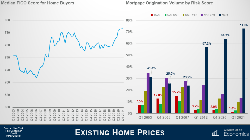
This chart shows the median credit – or FICO score – for home buyers approved for a loan and you can see the significant drop in credit quality that occurred in the early to mid-200’s.

But look at where we are today. The median credit score is now 788, and when we look at the numbers in a little more detail it’s even more remarkable as by early 2007 the riskiest borrowers – those with credit ratings below 620 – were borrowing 15% of all funds used to buy homes while prime borrowers we’re just below 24%.

But, again, look where we are today. The sub-prime share of mortgage borrowing has shrunk to just 1.4% while prime borrowers are now at a very solid 73%.

The bottom line is that credit quality is remarkably high, and not at all like the pre-bubble period.


Two graphs next to each other, the slide is titled Months of Inventory & Offers Per Sale. On the left is a bar graph titled ARM Share of Residential Mortgage Originations. The graph shows a jump of 12% to 35% between the years 2001 and 2004, while since 2012 up until April 2021 the numbers have hovered between 3% and 7%, most recently hitting 3.1% in April 2021. On the right is a line graph titled ARM Share of Residential Mortgage Originations, showing an overall downward trend from January 2018 through March 2021, the percentage peaking in November 2018 at just above 9%. Both graphs use data for FHA, VA, and Conventional Purchase Loans.


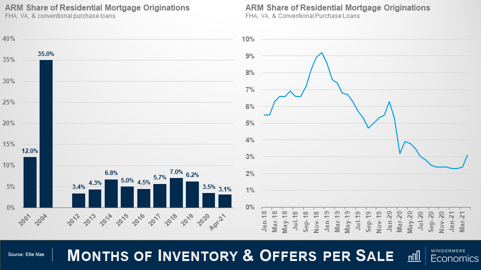
Earlier we discussed that between 2001 and 2007, mortgage debt doubled and much of this growth came via risky mortgage products – many of which were adjustable-rate mortgages that offered the buyer significantly lower monthly payments.

ARM’s accounted for 35% of all mortgage borrowing in 2004 but the current share is far lower, which should quell any concerns that there might be a wave of ARM’s resetting that could impact the market.

And as you can see here, the share has dropped precipitously, but has leveled off over the past few months before rising modestly in March.


Two graphs next to each other, the slide is titled Credit Is Tight Even As Owners Are Not Over Leveraged. On the left is a line graph titled Housing Credit Availability Index. It shows an overall downward trend from Q1 2000 to Q1 2020, with a spike between Q1 2004 and Q1 2007. One the right is a line graph titled Loan-to-Value Ratio, which is the ratio of total debt to value. It shows data from Q1 2000 to Q2 2020. The percentage began at roughly 40% in Q1 2020, peaking at around 55% between Q4 2009 and Q4 2012 before declining steadily, coming in at just below 35% in Q2 2020.


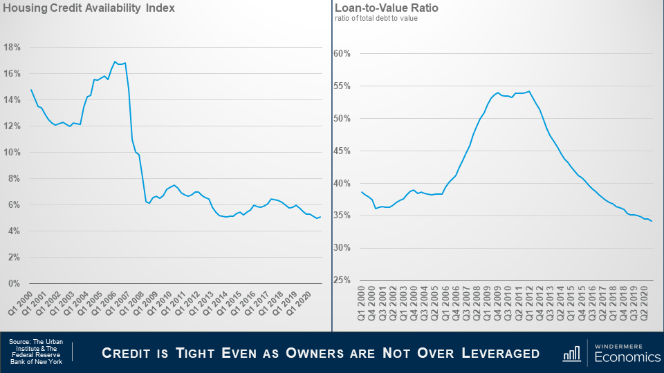
This is data from the Urban Institute that I use regularly. It’s their Housing Credit Availability Index (HCAI) and it calculates the percentage of owner-occupied home purchase loans that are likely to default—that is, go unpaid for more than 90 days past their due date, and I like this as their methodology also weights for the likelihood of economic downturns as well.

A lower HCAI indicates that lenders are unwilling to tolerate defaults and are imposing tighter lending standards, therefore making it harder to get a loan while a higher percentage suggests that lenders are willing to tolerate defaults and are taking more risks by making it easier to get a loan.

Lenders were all good taking risks in the bubble days but are certainly looking at things very differently now.

The bottom line is that even if the current default risk doubled, it would still be well within the pre-crisis standard of 12.5% that was seen between 2001 and 2003.

And this chart shows loan to value ratios – as the bubble was forming the ratio went up as buyers were getting over leveraged but look where it is now.  Well below pre-bubble levels.

Again, tight credit and significant equity puts us in a very different place than we were in the 2000’s.

My Forbearance Forecast


Two graphs next to each other, the slide is titled Mortgage Forbearance. On the left is a bar graph titled Mortgages in Forbearance, representing the total residential homes in forbearance. The numbers between April 23 of 2020 and May 4 of 2021 show a peak of over 4.5 million homes in May 2020, settling to just above 2 million in May 2021. On the right is a line graph titled Share of Home Loans in Forbearance, showing data for the same time period as the graph on the left. It shows a peak of around 9% in May/early June 2020, settling to around 4% in May 2021.


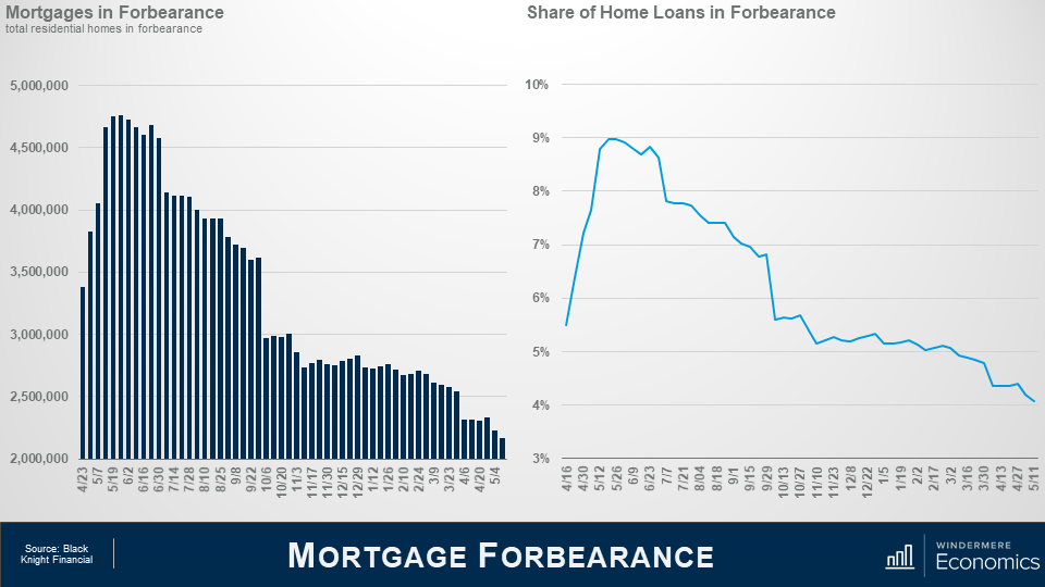
I am sharing forbearance data for one reason and it’s because some brokers have told me that they have clients who are thinking about waiting to buy as they believe that homes in forbearance will end up in foreclosure and the growth in supply could lead home prices to drop across the board, or at the very least allow them to pick up a home on the cheap.

But as you can see, the number of homes currently in the program is down by over half from its May 2020 peak – and that equates to 2.6 million homes.

In fact, even if all the homes still in the program did actually end up in foreclosure, it would still only represent a fraction of the nearly 10 million homes that were foreclosed on due to the housing bubble bursting.

And when we look at the share of total homes in forbearance, it peaked at just over 9% but is now knocking in the door of 4% and with over 250,000 more homes about to hit the end of their forbearance period, I anticipate that the numbers will drop further later month.

So why am I not worried that a large share of these homes will be foreclosed on? This is why.


Two graphs next to each other, the slide is titled Single-Family Home Prices. On the left is a line graph titled Homeowner Equity, showing the dollar amount in trillions, not seasonally adjusted. Between Q1 2000 and Q1 2020, the amount rose from just over $5 trillion in Q1 2000 to $21.1 trillion in Q1 2020. One the right is a line graph titled Share of Equity Rich Properties, showing the percentage of homeowners with more than 50% equity. Between Q1 2014 and Q1 2021, the percentage rose from just below 20% in Q1 2014 to 31.9% in Q1 2021.


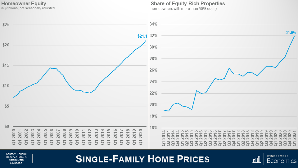
In the first quarter of this year homeowners were sat on over $21 trillion in equity – a truly massive figure.

You can see the buildup of equity as the housing bubble was forming and then it contracted through the housing crisis; however, since 2012 home equity levels have more than doubled.

My friends over at Attom Data Solutions estimate that, in the first quarter of this year, almost one in three homeowners in America had more than 50% equity in their homes – that’s almost 18 million homeowners.

And this tells me that a lot of owners in forbearance who just cannot get back on the right path still have the option to sell their homes in order to keep the equity that they have – after the bank is made whole, of course – rather than go through the foreclosure process.

And further support comes from the folks over at Core Logics who recently put out a paper suggesting that about 42% of all owners in the forbearance program bought their home before 2012 and they have, unsurprisingly, built up a sizeable chunk of equity in their homes, with median equity – even after they cover any missed payments – of almost $100,000.

Of course, it’s reasonable to say that this may all sound good, but what about owners who didn’t buy a long time ago and therefore have less equity.

Well, their data shows that 43% of owners in forbearance bought between 2013 and 2018 and they too have benefitted from prices rising and have an average of more than $87,000 in equity – again after accounting for missed payments.

And even the newest owners – those who purchased their home in 2019 or later – and they represent 15% of all homes in forbearance – well they still have an average of over $65,000 in equity.

The bottom line is that, in broad terms, a typical homeowner in forbearance could – with relative ease – cover the costs of selling a home and still have some equity left over.

Will foreclosures rise this year – yes, they will – but given all the facts I have just shared with you, I see it as being more of a trickle than a flood.

Well, there you have it.

In Conclusion

As far as I can see, all the data shows that we are in a very different place today than we were in the 2000’s and I find it highly unlikely that we will see a repeat of the events we saw back then.

Down payments are higher; credit quality is higher; and demographic demand for ownership housing remains robust and – quite likely will only grow as the nation’s Millennials continue to reach prime home buying. Remember that 9.6 million of them will be turning 30 over the next 2 years alone.

But, as I said in my opening comments, the pace of price growth that we’ve seen over the last year or so is clearly unsustainable and must, at some point start to slow, if only to allow incomes to catch up.

In fact, I am already seeing some tentative signs of this with the percentage growth in list prices starting to soften in several markets across the country which should start to ease the pace of sale price appreciation.

But I am afraid that I just don’t see a national downturn in home values occurring – unless banks decide to significantly loosen their underwriting criteria, but I find that very hard to believe.

Thank you for sticking with me during this rather long video. I do hope that you found it of some interest.

As always, if you have any questions or comments about today’s topic, please feel free to reach out. I would love to hear from you.

In the meantime, thank you again for watching, stay safe out there, and I look forward to visiting with you again, next month.

Bye now.

Living May 21, 2021

Tips for Sustainable Horse Property Management

Caring for a horse property is no easy feat. This is especially true when you are committed to having an eco-friendly property as well. Making small changes in daily land management practices can have positive impacts on the environment and your animals. Here are some tips to help make your horse property more environmentally friendly.

Manure Management

The average horse can produce up to 50 pounds of manure in a day. The way the manure is stored, distributed, and treated can have a significant impact on its value. There are a couple of options when it comes to repurposing the manure on your farm:

1. Composting

You can use the manure for composting as well as fertilizer for your pastures and gardens. Composting at the proper temperature can kill fly eggs and larvae, parasites, pathogens, and weed seeds. Using it for your pastures and gardens acts a slow-release fertilizer and is the perfect soil conditioner.

2. Distribution

If composting is simply something you don’t have the time or money for, you can also ship out your horses’ manure. There are many different organizations that will connect you with gardeners who are looking for the excellent fertilizing properties of manure.

Regardless of what you choose, storage is an important factor to consider, as it is vital to safeguard against surface and groundwater contamination. Make sure your manure storage is safely distanced from water sources and ideally covered and contained to prevent pollutants from leaking, bugs, and odor.

2. Water Conservation

Horses are notoriously very thirsty animals and acreage properties require a lot of water to upkeep their pastures. There are numerous ways to conserve water on your horse property.

1. Install Rainwater Catchment

You might as well take advantage of the free water mother nature provides on a rainy day. Using a rainwater catchment system can help you catch and store water during rainy periods. Depending on where your barn is located on your property, you may be able to meet all your horse watering and irrigation needs with a large catchment basin.

2. Automatic Waterers

Installing automatic watering systems can help conserve water, as well as keep the water cleaner and fresher for your animals. Some water systems are powered by geothermic heat. Using this technique keeps water cool in the summer months, and above freezing in the winter. And since it is powered by geothermic heat, you aren’t using additional electricity!

3. Reuse Water

Another great way to conserve your water use is to reuse leftover water from other daily tasks. Leftover water from horses’ buckets can be used to water the garden. Also consider using a bucket and sponge for your horses’ baths to prevent any further water waste.

3. Preserve Pastures

Pastures are a great source of food for your horses but do require a good amount of work. Luckily, a lot of that work can be done in a way that is environmentally friendly. As discussed above, using the manure from your horses on your pastures work as a great nutrients rich fertilizer. Overgrazing horses can make the land more vulnerable to erosion and lead to less of a filter for runoff. To prevent this, incorporate rotational grazing. Rotational grazing moves horses from one pasture to another allowing for regrowth and optimizing the horses’ foraging diet. This method also allows for plant diversity and improved soil structure.

4. Reuse and Recycle

A tried and true method to property sustainability is reusing and recycling. Consider reusing equipment when available or even repurposing old containers and tools for other uses around your property. For example, old water troughs make for efficient gardening containers. If you are looking to make some improvements to structure on your property, consider using recycled or renewable materials whenever possible. Recycled rubber stall mats are an easy way to incorporate recycled materials into your barn.

Living May 19, 2021

7 Tips to Give Your Short-Term Rental a Competitive Advantage

As the usage of short-term rental services has increased over the years, so too has the competition between rental owners to make their properties stand out. There are a variety of marketing tactics you, as a rental owner, can employ to give your home an edge, but ultimately, making the property as appealing as possible is the best way to ensure your strategies are effective.

7 Tips to Give Your Short-Term Rental a Competitive Advantage

1. Boost Your Curb Appeal

Renters are scrolling through pages and pages of properties, looking for something that catches their eye at first glance. To make your property stand out, invest time and energy into the home’s curb appeal. Making these improvements doesn’t necessarily require breaking the bank, either. Simple projects like a fresh coat of exterior paint, refinishing the patio or deck, and creating a beautiful yard will go a long way towards helping your home stand out amongst the competition.

2. High-Quality Photography

Once you’ve spent time curating and beautifying your rental, it’s important to communicate its feel to potential renters. High-quality photos give renters the best impression of what it’s like to spend time in the home. Photograph every room in bright lighting to make the space as inviting as possible. Be sure to thoroughly clean every room before taking photos to have it looking as inviting as possible.

3. Improve Your Description

After potential guests explore your photos, they’ll read your property’s description. While it’s helpful to read descriptions of other listings in your area to get an idea of what tenants are looking for, it’s important to communicate the unique attributes of your home. Talk about what makes it special, emphasize the selling points, and reference what renters are seeing in the photos you’ve provided.

4. Repair or Replace Your Appliances

When guests are paying for a rental, they expect everything to be in fine working order. To make your property stand out, consider repairing or replacing your appliances. This makes for a more enjoyable stay and could potentially offer you a competitive advantage. All appliances have a certain life expectancy, so if you haven’t replaced your appliances in a while, it just may be time to do so.

5. Upgrade Your Bedroom and Bathroom

Renters are looking to relax, so any luxury you can provide them will do wonders for giving your property an edge amongst the competition. Two areas of the home where you can deliver on luxury are the bedroom and the bathroom. From the bedspread and pillows to the curtains and rugs, experiment with different textures in the bedroom to make it as comfortable as can be. A high-quality mattress is also a worthy investment to make your guests’ stay all the more memorable.

By making simple upgrades to your bathroom, you can give the guests the feeling of having their own personal spa. High-quality shower heads and a spacious, relaxing tub will help to deliver a luxurious atmosphere to your bathroom, as will meticulously cleaning the space and keeping your surfaces well organized.

6. Upgrade Your Kitchen

A welcoming kitchen is the key to making your rental feel like home. Kitchen makeovers often come at a high cost, but there are ways to transform your kitchen without breaking the bank. Start by upgrading your lighting, giving your walls a fresh coat of paint, and refinishing your cabinets. If your kitchen needs new appliances, remember to select them first before making any renovations to ensure their dimensions are correct.

7. Provide a Workspace

With more people working remotely than ever before, some renters will likely look at your property as a potential place to conduct their work. Accommodating these guests with a quality workspace can make your rental stand out. Consider making the workspace multifunctional using items like a folding desk. This gives remote workers the option to stow their home office setup at the end of the day while ensuring that the workspace won’t be a permanent fixture for guests on vacation.

Buying May 17, 2021

Moving Into a Vacation Home

For some homeowners, purchasing a second home – or a vacation property – provides a place where they can have a change of scenery and an escape from day-to-day living. Since the start of the pandemic, a number of homeowners have chosen to move into their vacation homes to do exactly that on a longer-term basis. However, certain aspects of buying and moving into a vacation home differ from a traditional home purchase, so it’s important to work with a buyer’s agent who understands the nuances of both.

Before You Buy

One of the first things to consider before buying a vacation property is whether you are financially ready to take on everything that comes with managing and maintaining another home. If you’re still in deep with your primary residence’s mortgage and are not cash-ready, it may not be the best time to purchase a second home.

Like any home purchase, there are pros and cons to owning a vacation home. Vacation properties are likely to retain their value depending on where they’re located. They also allow you to experience the never-ending vacation lifestyle. However, owning a vacation property can come with its own set of unique expenses. Not only will be you responsible for all the maintenance work that you might normally leave to a property management company, but if the vacation home is located on the water or a steep hillside, you can also expect higher homeowner’s insurance costs.

Moving In

Any moving process presents unforeseen challenges and moving into a vacation home is no different. Whereas previously the home provided accommodation for relaxing, moving in will require it to meet the demands of everyday living. It may be high time to make repairs or upgrades to the home, which could drive up your move-in costs.

Before moving in, assess the condition of all furnishings to get an idea of what needs replacing. Making the home your main residence will put added strain on your appliances, so what may have previously worked well for short-term stays won’t cut it for full-time living. Check your refrigerator, dishwasher, and washer and dryer to see if they need updating before moving in.

If you’ll be working remotely in your vacation home, think about your desired work conditions before putting together your home office. Having a designated workspace will help balance your home and work life.

MoreWindermere Foundation May 14, 2021

Windermere Foundation Approaches $500,000 Raised in 2021

In the early months of 2021, Windermere offices have continued to give back to their communities. Across Windermere’s 10-state footprint, over $417,000 has been raised this year alone, bringing the total raised by the Windermere Foundation to over $43.7 million since it began in 1989. Thirty-eight percent of this year’s funds were donated by agents from their commissions, while sixty-two percent was raised through fundraisers and additional donations made by owners, agents, and staff. These dollars go toward supporting low-income and homeless families in the communities where Windermere has offices, such as those described below.

Windermere Fort Collins

In late March, the Windermere Fort Collins office stepped up to make a significant impact in their local community by donating $10,000 to ChildSafe Colorado. The organization’s mission is to break the cycle and heal the trauma resulting from childhood abuse and neglect with specialized treatment, education, and community outreach. The Windermere office’s donation will help ChildSafe run its day-to-day operations. The organization is Northern Colorado’s only comprehensive outpatient treatment program for child and adult victims of childhood abuse, treating about 700-800 clients per year.

Windermere Lane County

The team at the Windermere Lane County office in Eugene, Oregon continues to be highly active in their community. So far this year their donations include $2,200 to Bags of Love, which provides necessities and comfort items to children who are in crisis due to neglect, abuse, poverty, or homelessness. Another $2,200 went to CASA of Lane County, which provides court-appointed special advocates to serve neglected and abused children aged 0-17. A $2,500 donation went to Kids First Center to further their impact in the community. Kids First is part of the first response team that supports the healing process when a child is a victim of abuse. Donations of $603 and $2,200 were made to Florence Food Share and Food for Lane County respectively, two organizations dedicated to reducing hunger locally. Lastly, the Windermere Lane County office made a $602 donation to the local Boys and Girls Club of Western Lane County. All in all, these donations totaled over $10,000.

Windermere is so proud of our owners, agents, and staff, and all they do to give back. We are grateful to everyone who has supported the Windermere Foundation – it is because of you that we are able to help our neighbors in need and make an impact in the communities where we serve. To help support programs in your community, click the donate button below.


To learn more about the Windermere Foundation, visit windermerefoundation.com.